Arranging wall art at home: an insider guide
03.2022
Want to add a touch of style to the walls of your home? Discover our tricks and tips and understand which works best for you.
Arranging Wall Art: What do you need to know?
Who doesn’t like a beautiful wall covered in beautiful paintings? Not only can art be incredibly aesthetically pleasing it can also be an excellent way of injecting colour and personality into your home.
Unlike furniture, paintings have the advantage of allowing you to give a stylish impression without compromising on space and the layout of a room. In short? Art can be an excellent remedy to bolstering interior design when you’re short on square metres. However, when it comes to deciding how to arrange and hang your artwork, things can be more difficult than they might first appear.
How do you decide what goes where? For a gallery wall how can you make sure your artworks work together? Where do you even start?
In this essential guide we’ll endeavour to answer all your questions about how to arrange your art. We’ll cover the main rules for arranging with insider tips and look at the best ways of curating your collection so that your art can flourish and foster a harmonious atmosphere in your home.
Are you ready? Let’s get started!
Arranging Art: The Basic Rules
So we already know that a wall enriched with paintings can, at a glance, give elegance to a room.
However, although it may appear effortless once it is completed, a beautiful arrangement of art on a wall is not easy to achieve.
There are many factors to be taken into account when embarking upon the delicate process of dressing your walls. Some may be more obvious than others but we like to think we’ve gathered some useful insider tips about how to get these arrangements just right.
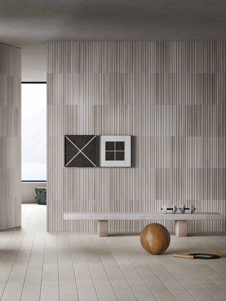
Whether you’re looking to create a unique composition of works or to hang a single painting it’s useful to keep these simple rules at the forefront of your mind.
A successful balanced arrangement of art tends to hold the following characteristics:
- Dimensional consistency
- Formal coherence
- Linear arrangement
So, let’s break these basic rules down. First things first, it’s best to always consider the size of the paintings, photographs, or framed objects you’re dealing with. After all an artwork should should fit on the wall it’s going to decorate: too large and you won’t be able to see the artwork properly, too small and it’ll sink into its surroundings.
When selecting an artwork for a specific space you should first carefully study the area you want to decorate. Visualisation is key, take your time to assess how each artwork would interact with its surroundings, these relationships are about more than just proportions.
A careful study of the wall should be accompanied by a careful study of the room. After all walls aren’t isolated features, when selecting your artwork you always want to be thinking about the bigger picture. How will all the components come together? How can they work in harmony?
Each painting should carefully reflect or respond to the room it eventually belongs to. Decorative details such as artworks and paintings tend to be one of the final touches when styling a space, so it’s helpful to use this to your advantage and study the unique character the room has already gathered through the ways you’ve already chosen to style it; whether that be through colour scheme, flooring, or furniture.
Remember inspiration can strike from anywhere. Perhaps a certain shape, a curve, a line, or frame evokes another? Perhaps you want something to bring out the colour of the flooring? Or a work which hints at the colours in a specific piece of furniture? All these points of reference can be winning choices to achieve a harmonious ambiance in your home.
In addition to abiding by the dimensions and style of the space, another key point when deciding how to hang paintings is knowing at what height you wish to place them. Formal coherence is key; there’s nothing worse than an artwork struggling for space. In the instance of height either extreme for art tends to bring with it complications: too low or too high and the art will disrupt the natural flow of the room. Worse: it won’t be seen at all.
When it comes to hanging the artwork on the walls the general rule is that an ideal arrangement should situate the centre of the painting, or paintings, at human eye level. As a guide it’s useful to assume a person of average height, or roughly 160 centimetres from the floor.
A useful strategy can be to imagine an invisible line on the wall as a means of understanding how best to position the paintings in response to the people entering the room.
However, as with all rules, some are made to be broken. As we’ll soon discover the ideal height of artworks can vary depending on the room being decorated, and especially when a piece of art is being arranged as part of a larger composition like a gallery wall.
How to Mix and Match Your Artworks
When it comes to hanging a single painting on the wall, coordinating an artwork with its environment can be fairly fast work. However when we begin to think about how to bring different artworks together to create a gallery wall the question becomes more complicated. Personal taste always plays an important role, but to make a balanced composition it helps to identify a key theme which unites the artworks.
In principle, you can choose to combine your paintings depending on:
- Theme or style
- Type
- Dominant color
Theme or Style
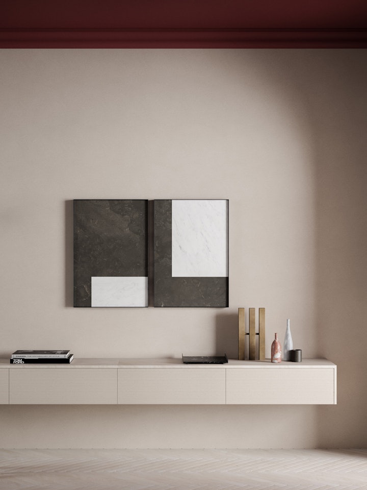
Establishing a theme that ties your whole composition together is a wise move. Think broadly, perhaps a classic landscape wall? Or why not take inspiration from our Intarsi range and gather together a sophisticated homage to geometric abstraction?
Whichever path you choose, it is always important to remember that for the right balance a dominant theme should be followed by a dominant style. Clashes and contrasts have their place, but juxtaposing figurative elements with abstract ones is best avoided. Less can be more in these cases and usually it’s best to just focus on one or the other rather than mixing too much.
Type
Another way to create a beautiful and cohesive gallery of paintings is to install a single type of work. One style that never fails is a series of juxtaposing paintings on canvas, or a beautiful composition of photograph.
Whereas combining different mediums together, such as a poster and a painting on canvas can often accidentally detract from the overall impression of the artworks. Like boosts like, so it can be a powerful design tip to group similar mediums together.
Colour
Finally, perhaps the most obvious path to take when curating our art collection or organising our paintings: colour. To create a calming and cohesive room it’s important to select works that complement each other.
Remember juxtaposing canvases with completely mismatching nuances will not come together, it’s best if there’s at least a thread of continuity between the paintings selected, however small.A gallery wall or composition of artworks with a bold dominant tone, such as a dark emerald green or rustic terracotta hue can imbue a simple white washed wall with a much needed spark of colour.
Then again monochrome can provide a chic alternative, the timeless combination of black and white always stands out and never ceases to make a room look polished and put together. A gallery of photographs arranged in this manner cannot help but impress and excuses both personality and charm.
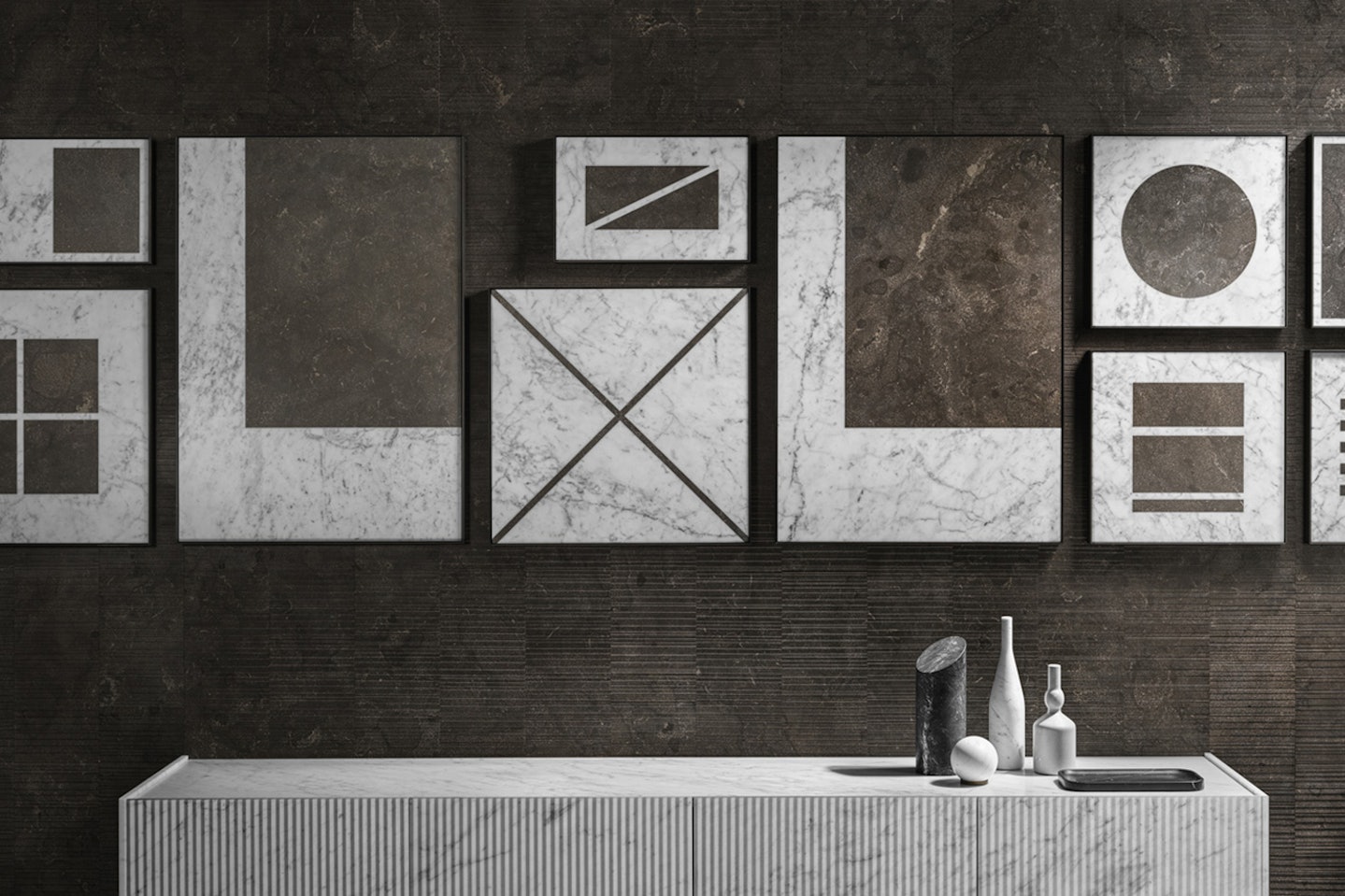
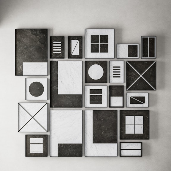
However, managing to create a gallery of paintings that coexist harmoniously is not always a simple task. Salvatori has managed to find an answer to this problem with the creation of the Intarsi range of natural marble artworks: in this line, the luminous white tones of Bianco Carrara and the deeper shades of Pietra d’Avola intersect in a confrontational play of geometric forms that allows you to experiment with a variety of effects.
This selection of styles makes it possible to create an extremely cohesive gallery wall, all thanks to the shared visual language of the marble details that ground the artworks and endeavour to compliment each other no matter the style, type, or colour.
Hanging Artwork at Home: A Few Key Rules
After succeeding in finding artworks that work together and with your space there is still one important detail to discuss: how to arrange the art effectively?
Again, some simple rules combined with some cunning geometry can help us. These rules of interior design can aid even the most inexperienced decorator, and whether your plans are simple or complex or the scale of your project small or large we think you’ll find some inspiration.
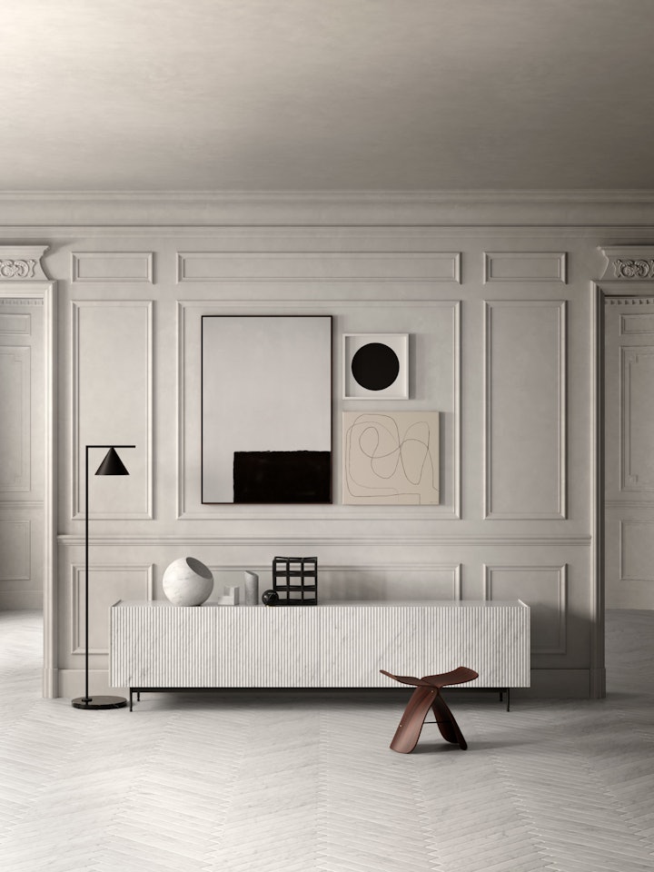
Ultimately we can boil down these design rules for hanging paintings to four fundamental methods:
- Linear
- Radial
- Framed
- Geometric
Linear
The first method is certainly the easiest. Imagine a line on the wall, horizontal or vertical, and arrange the artworks along this line.
This technique allows us to expand the depth of a room vertically or horizontally – depending on the orientation – and is particularly well suited to following the lines created by a specific piece of furniture. For example, if you are arranging paintings above a sofa or another piece of horizontal furniture the artwork can act as a visual extension of a colour scheme or layout. Just think about how the profile of the Adda modular drawers could be enhanced by a series of artworks in a carefully curated linear arrangement. Not only does it draws the eye along the wall, it evokes a natural correlation with the existing elements in the room: the art really feels at home.
Radical
Looking for something a little less orderly? The Radical arrangement will suit you perfectly.
To start with, all you have to do in this method is choose a large artwork. This piece then acts as a focal point in the room, a strategic centre from which the other works will emanate. Once you’ve positioned this key artwork, you set out arranging all the other artworks in your composition. The trick? Take care to maintain the same distance from the central frame, even if the other pieces vary in size.
The key is to maintain a consistency in the distance, a small but crucial detail which allows the artworks to emit an air of harmony and order.
Framed
Need a style to meet you in the middle? For an effect which takes the best of both worlds (the geometric order of the linear and the freedom of the radical), we have the frame arrangement method. In this case the paintings, of different shapes and sizes, are set out to depicts a larger geometric form, such as a large square. The various canvas sizes and frames working together on the wall to project a unified vision.
Geometric
The last method involves styling artworks in selected blocks, a technique that allows you to use a mixture of the previous styles to adapt to the ambiance of the room. An alteration of linear and framed arrangements, for example, can be perfect for decorating the wall of a staircase, the up and down of the artistic arrangements echoing the design of the steps and breaking up the line of vision to add a deeper dimension to the space.
Having seen what these main patterns are, all that remains is to analyse what type of arrangement best suits the different rooms in your home. To do this, let’s take a look at the most common and most unusual rooms in our homes, making use of the versatility of the Intarsi collection as we explore…

Art in the Bedroom
In the case of the bedroom, traditionally the place for art is above the headboard on the wall where the bed rests. This tends to be a rather large empty space to decorate, and so lends itself well to the use of large paintings or a composition of large paintings.
As far as themes and colours are concerned, it always tends to be better to stick to works with neutral tones. Although bright colours can be fun when the focus of a room is to get a good night’s sleep we want to ensure that our colour scheme cultivates an environment that’s calm and promotes relaxation above all else.
A perfect example of this can be found in the bedroom pictured, which is decorated using a beautiful frame arrangement, and presents a composition that accentuates the natural architecture of the room itself.
The colour palette drawn from the natural stones that make up the artworks above the headboard creates a subtle contrast of neutral shades which compliment the existing decor in the room.
The enveloping shade of the White Carrara marble in the artwork, links delicately to the body of the precious Urano lamp on the bedside table, running a fragile line of restorative white throughout the room which manifests in unexpected details: accessories such as the lidded tray, the smooth curve of the candle holder from the Lui&Lei collection, there’s even a tie to the refined lines of the Dritto coffee table.
As you can see by using these subtle accents of colour throughout the room to our advantage a careful attention to details can unite an environment as a calming cohesive whole.
Art in the Living Room
A living room takes after its name, it’s a room in which a lot of living takes place, and with this in mind the arrangement of art on the walls of a living room tends to be less strict than in other areas of the house. This freedom means that the position of art on the walls can be fairly relaxed.
The living room, along with the entrance hall, which can often overlap, acts as a calling card for the house at large. As a central space for entertaining and a heart of the home, this means keeping an eye on the design and decor takes on a much greater importance.
Artworks have the opportunity here to communicate your personal taste to visitors but in the process of decorating empty walls they are also able to enhance specific elements of decor, such as a cabinet or sofa. Art can make a room just that bit more inviting, it speaks not only through its subject but through how it interacts with its surroundings.
As we anticipated previously, this is one of the cases where the ideal height of a painting can change. For example perhaps to align with the back of a sofa the focal point is lowered to 140 centimetres. This can be a cunning move to bolster the natural lines of the room, but remember things don’t always need to be aligned or ordered in order to make an impact. Let’s take a look at this example living room together.
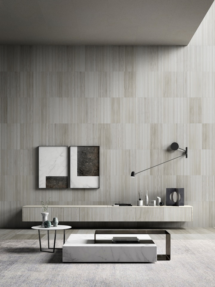
The orientation of the outer frame, made with the larger sizes of the Intarsi artworks manages to create the illusion of a large book mounted on the wall.
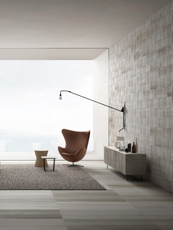
The marbles from which it is composed create a playful contrast which chimes beautifully with the rich tones of the dynamic Silk Georgette® Plisse that covers the room along with the Balnea modular drawers.
There is an intimate architectural conversation between the shapes and materials in the room. Small accents like the original Kilos bookends appear not merely as functional accessories but suggestive hints that extend and respond to the interior’s linear play.
The gentle sculptural lines and waves of the Omaggio a Morandi series, or the smooth surface of the Gravity paperweight embellish the suspended furniture and enhance the room’s majestic centre piece: the Ta-volo table-sculpture.
This unique design with its slick contours becomes a central vocal protagonist in the living room, largely thanks to the expert framing of the minimalist aesthetic that surrounds it.
Art in the Corridor
The humble corridor. Although this architectural asset is sometimes considered a mere place of passage and often risks being neglected the design potential for such a kinetic space is rich and varied. There’s nothing sadder than a corridor with bare walls, especially when it often acts as the vital connecting space between areas like the living room and the bedroom.
Establishing a composition of paintings in your corridor can prove to be a really beneficial choice, and the decision can do wonders to enliven a busy interior.
If the corridor is long and narrow a simple linear arrangement reminiscent of a modern gallery is the best choice: this arrangement, as we have seen, increases a feeling of depth and can add a much needed new dimension to a simple space.
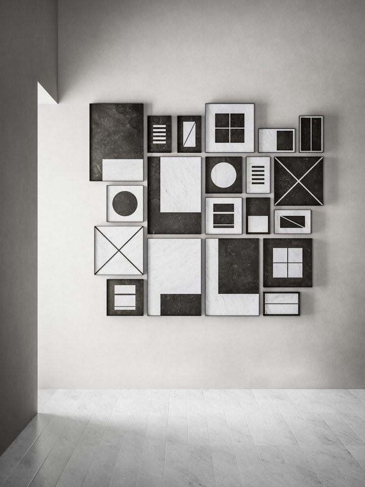
If your corridor has irregular dimensions or a strange shape there’s even more potential to indulge in dramatic compositions when hanging wall art. One good example can be seen here.
Looking closely at this gallery wall, you can see how the various formats are arranged on the sides of an imaginary central vertical line. On one side and on the other side of the line, the playful compositions of the marble panels from the Intarsi collection create rhythm and movement; the chromatic games forging a harmony of contrasts that unites the works, so that together they appear not as individual components but as a grand artistic collective.
In this way, the corridor takes on a new importance and a renewed vitality, with every person who walks down it drawing a new energy from its decorated walls with every visit.
Art in the Bathroom
We’ve left the trickiest till last, last but not least: the bathroom. Bathroom decor and art has an intriguing history but modern trends have seen artworks return to the hallowed halls of this essential living space.
As a temple of domestic relaxation the bathroom should never merely abide by functional design rules, aesthetics in this room are just as important. After all, relaxing in a beautiful bathroom is a much easier and a lot more enjoyable experience.
Modern designs have responded to this desire by developing elements that combine practicality and style. Just look at the seductive curves of the free-standing Anima bathtub or the ethereal lines of the Ninfa washbasin.
Adding art to the mix of luxurious design enhances the bathroom as a space of tranquility while allowing you to create a truly unique environment to call your own.
But which artworks work in the bathroom? It’s a difficult choice. Large bathrooms tend to be quite rare, so as a rule of thumb it’s advisable to use paintings and frames that are on the smaller side. Size isn’t everything and something small, if chosen with care, can exhibit a lot of personality.
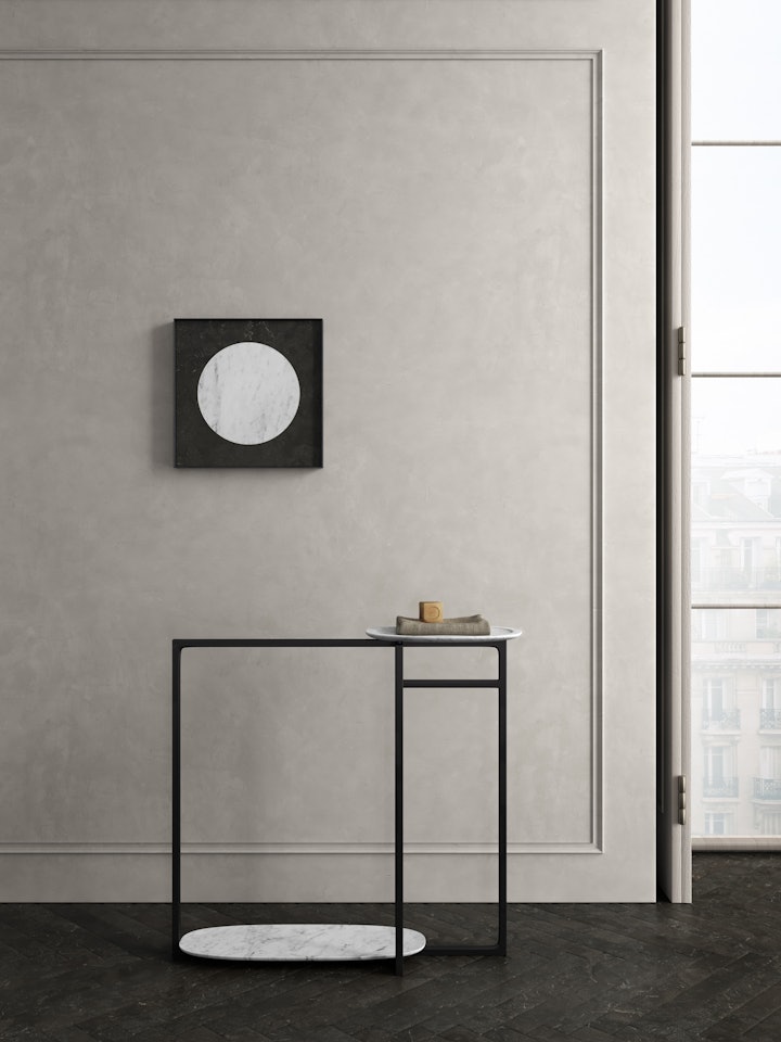
Intarsi lends itself very well to this environment. The immense durability of marble makes it the perfect choice to decorate wet environments. Not only this but the natural veins of stone which ripple through the marble slabs and shapes act as conductive roots, a beautiful reflection on the natural world in which water plays such a central part. In this image you can see clearly how the geometric play between the M03 Intarsi shape manages to foreground the essential lines of the Anima original freestanding towel rack. All the elements work together to create a serene space in which relaxation is paramount. The natural order of things, the balance and harmony of the artwork with the objects around it, establishing the art as a central and collective component of the room.
