The 3 errors to avoid when decorating an entryway and 5 inspiring examples
03.2022
Does the entrance to your home need a bit of a lift? Have a look at these 5 inspiring examples of gorgeous, practical entryways
All you need to know about decorating an entryway
The entryway to your home sets the scene when visitors first step across the threshold, or even stand on the doorstep, getting a glimpse into your lifestyle and taste, so it’s important to ensure that it reflects the rest of your house and your personality. After all, first impressions really do count!
At the same time, this is an area that needs to be functional, which is why we’ve put together this guide to how to achieve that balance of practicality and aesthetics and, most importantly, what are the key errors to avoid when designing or furnishing your entrance way. And, as always, we end with winning décor solutions, providing you with inspiration and ideas for decorating the entryway to your home.
Entryway design: the 3 big errors to avoid
The tree big errors to avoid are:
- Ignoring practical aspects
- Exaggerating
- Underestimating the importance of lighting
A home’s entrance or foyer must be welcoming and practical. Even though it may be an area you simply pass through, it serves many functions.
It’s where you need to be able to easily pick up or leave all those everyday items that you want kept handy and near the door, such as jackets, bags, keys, umbrellas and maybe even shoes. So, the bottom line is that you need furniture that is, first and foremost, highly functional.
That means you need surfaces to place things on and essential elements such as wall hooks. You want to avoid having a sparsely-furnished or empty space.
There are many smart storage and space-saving solutions so there’s no need to have to scatter your keys and other daily paraphernalia around the rest of the house.
That said, however, it’s important not to exaggerate and go completely the other way, covering up every cm of wall and floor surface with shelves and cramming as much furniture as possible into it.
This is especially true where you’re tight on space or have a low ceiling, as you’ll inevitably end up with an entrance that looks and feels cluttered.
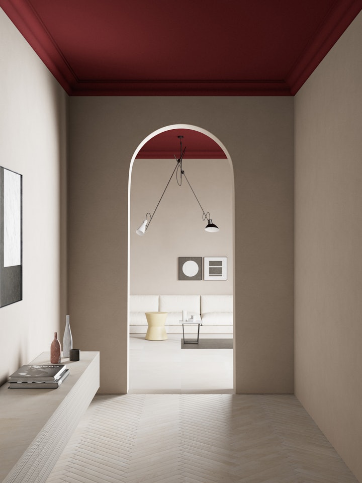
Exaggeration should also be avoided when it comes to colour and styles, as it is all too easy to go overboard and end up with a chaotic jumble that assaults the eyes.
The trick here is to stay with a very limited palette of colours and choose styles that are close to each other in look, as this will help make your entrance way inviting and orderly. It should ideally create a sense of calm and the sense that you are either stepping into or leaving a tranquil, well-balanced environment, so select soothing colours that help achieve this.
Last, but not least, don’t forget about lighting. A dark entryway is not only somewhat oppressive but also a little sad, and certainly won’t help to create a welcoming atmosphere.
The ideal solution is, unsurprisingly, to find a way to make use of natural light, maybe through an open plan layout or if you are able to add a window, but of course these options are not always possible. In that case, rather than opt for a single light fixture, choose a number of light sources, particularly if you’re dealing with a large entrance or foyer.
LED ceiling lights are an excellent choice, but standing lamps, if you have the room, also add a nice touch to the décor, as are wall sconces, while LED strips can be strategically placed so that they are not visible but provide plenty of illumination.
Once again, the “everything in moderation” rule applies, as too much light can result in an effect that is sterile or overpowering.
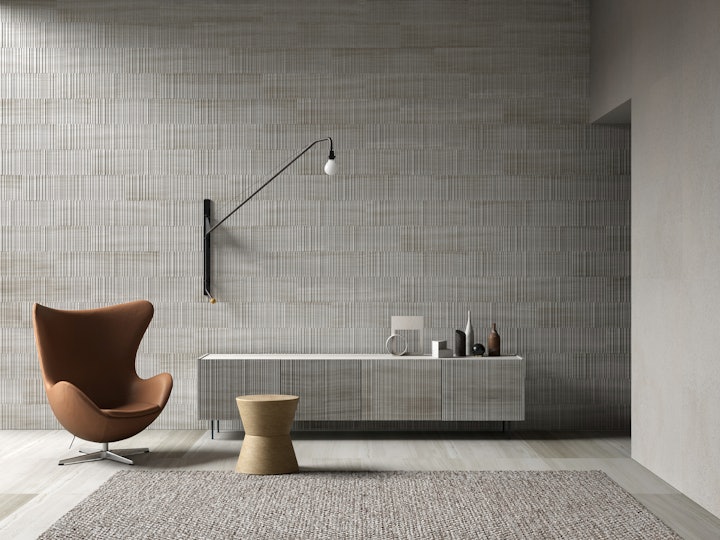
The first thing to do is take a good look at your entryway and really think about the space you have. Not just in terms of size, but also layout.
It doesn’t matter if it’s not much bigger than a cupboard, or even if it’s indistinguishable from the hallway, you can make it inviting and stamp your own personality on it. Tempting as it may be to simply go for one of the many ready-made décor solutions available, they are often not only a little bland, but are not suited to all types of homes.
Once you’ve done this, the fun part starts as that’s when you can start planning and designing your home’s entrance, letting your imagination run wild (but without exaggerating, of course!).
To get you started, here are five examples of stylish and practical entryways, Salvatori-style.
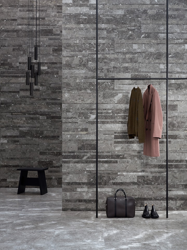
Uncluttered, contemporary and functional
Given that the entryway is first, and foremost, an area where you mainly pass through, it needs to be orderly and tidy, so that you don’t find yourself brushing past things or knocking into cupboards or bulky coat stands as you’re rushing out the door.
Of course, it should also be practical, so you will want to choose furniture that is designed specifically, but in the interests of keeping the area elegant and uncluttered, keep it to the minimum as in this example of a modern foyer.
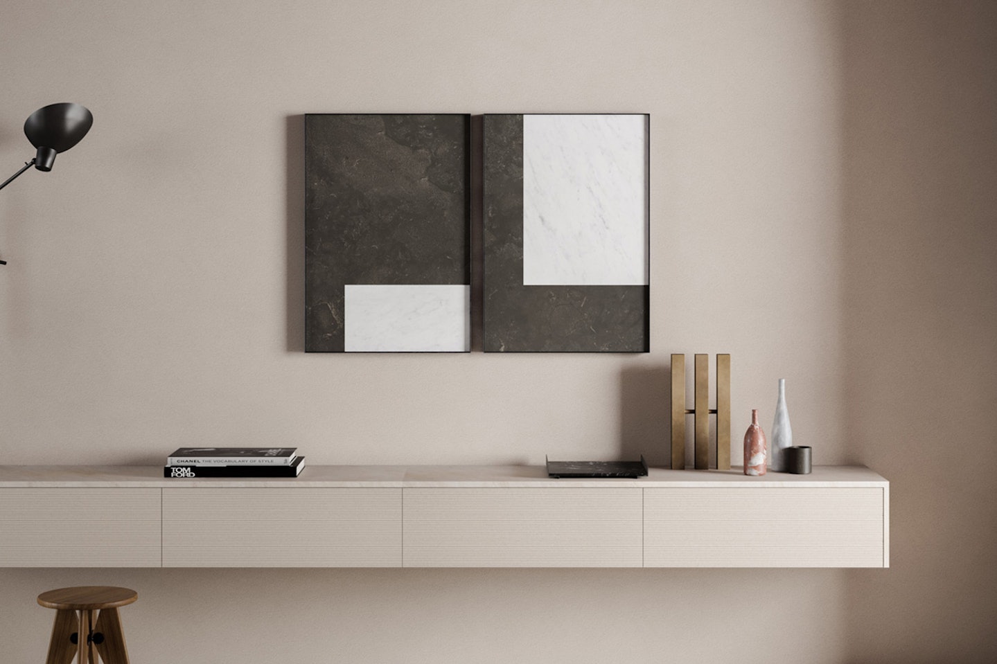
Here, the style is very much minimalist, using very few pieces of furniture, but choosing sophisticated design solutions that combine functionality and aesthetics, such as the bench-cum-shelf in Bianco Carrara marble.
There’s plenty of room to leave shoes, bags and hats, but also it provides a seat to perform those seemingly simple tasks such as removing or donning shoes.
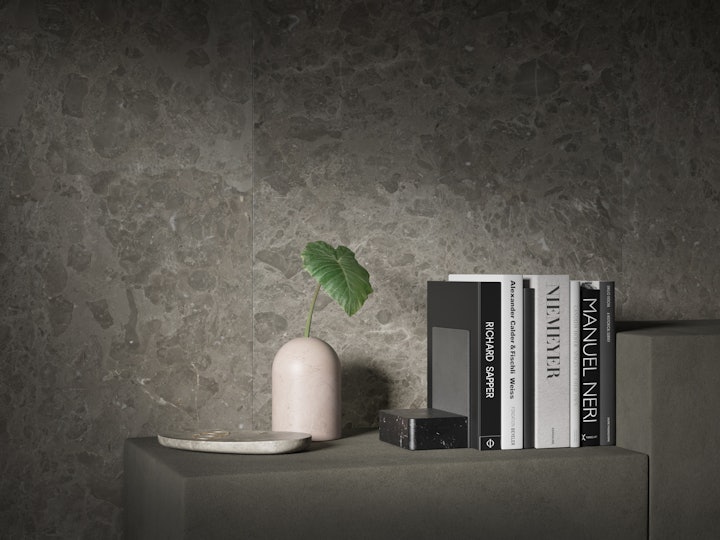
The Silo ceiling light is a cluster of cylinders carved from Pietra d’Avola and definitely ticks both the function and form boxes, while the elegant frame in dark metal is a surprisingly simple but extremely stylish solution for hanging coats, completely in keeping with the pared-back design of the entire space.
Organisation and styling are the key words for this entrance, and the combination of Bianco Carrara with Gris du Marais on the walls and floor creates the perfect canvas, setting the scene – and expectations – for what lies beyond.
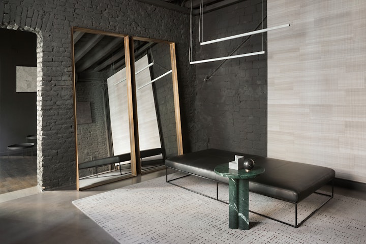
A mirror is always an excellent idea in an entryway or hallway, but you need to position it with care as it’s generally not recommended to hang it directly in front of the door.
This is particularly the case for a large mirror as this can distort the perception of space and also be a little disconcerting for guests if that’s what they see as soon as they enter the house, especially if they’re stepping into a small entryway.
The ideal solution is to position the mirror off-centre from the door, hanging it on a side wall. If you have the space, choose a full-length mirror and simply prop it against the wall. Whatever the size of your entryway, however, the bigger the mirror, the better, as it will amplify the sense of spaciousness and add depth.
The Quadro mirror hits the mark perfectly. Available in four sizes, its deep burnished brass frame brings understated elegance to this anteroom, which also features a side table in Verde Alpi marble from the ‘Love me, Love me not’ collection for a touch of sumptuous Made in Italy flair.
Subtle lighting comes in the form of a pair of Farfalla ceiling lights, each a long slender rod of Bianco Carrara marble that flutters gently above the space, true to the name, which translates as “butterfly”.
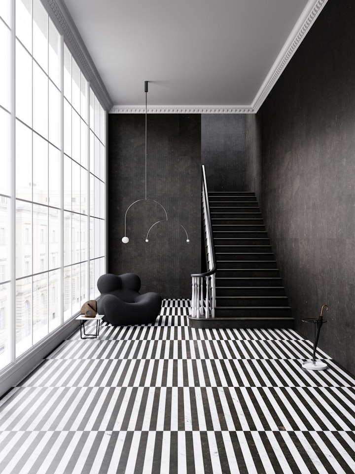
Comfortable seating
If you have the space, we’d suggest including some sort of seating, whether that’s a pouf, a chest, armchair, stool or bench, whichever option suits the style of the environment.
In this vast foyer, we went for a lovely large armchair that is not only inviting, but also brings a touch of soft contrast to the bold, pared-back décor in natural stone. Its positioning creates a welcoming nook where you can sit down and remove or put on your shoes in supreme comfort.
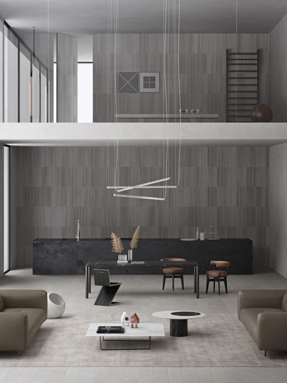
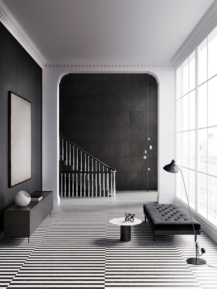
This entrance with an exposed staircase is a contemporary take on those often found in industrial-style loft apartments, and we’ve further tapped into that look by choosing darkest brown Pietra d’Avola in a honed finish on the stairs and in the clean fluid lines of Bamboo texture on the walls. Its dark and moody, but also lends a sense of harmony to the entire space.
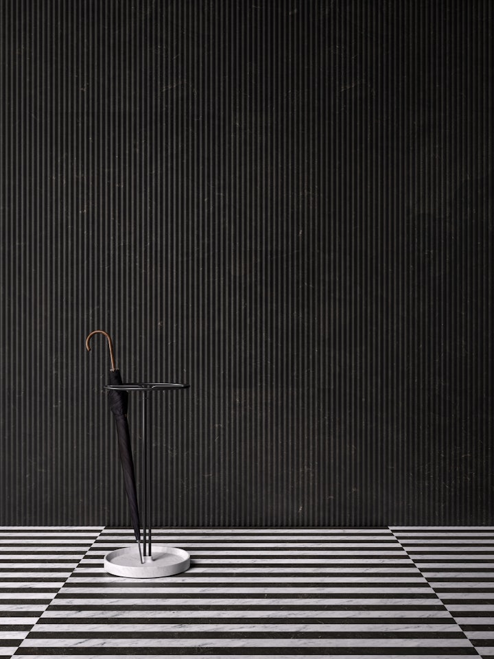
It also provides the perfect backdrop to the striking striped floor, a design that not only presents visitors with a real wow factor when they enter, but also amplifies the sense of space.
Last, but not least, a stylish and highly useful accessory comes in the form the Pietra L07 umbrella stand, a chic and unconventional take on what is often considered a rather prosaic object but here, adds flair and personality.
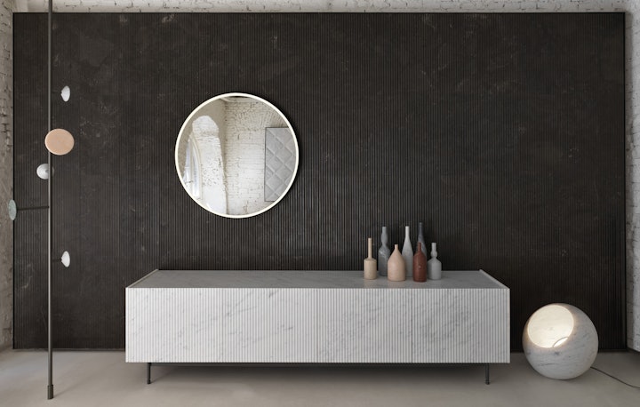
Now let’s take a look at a space that contains a winning trio of items to furnish an entryway: mirror, coat stand and a handy surface where you can quickly scoop up items such as keys and your wallet as you leave.
The Flamingo coat stand is a perfect space-saving solution with its slender pole in dark metal and five discs in a range of natural stones, while the Mirari backlit mirror ensures you miss nothing as you do that final check before opening the front door and heading outside.
Then there is the elegant and innovative Pliss cabinet, the epitome of the concept of functionality and aesthetics. With its deep, spacious drawers clad in textured Bianco Carrara, there is plenty of space for hiding all those essential bits and pieces, leaving the entryway uncluttered and stylish, but easy to access as you leave home.
This space also contains an interesting solution for lighting, that other essential item when it comes to furnishing a hall or entrance. Here we have the iconic Urano floor lamp, a perfect sphere of carved white marble, that casts a lovely soft, relaxing glow that envelops visitors as soon as they step inside.
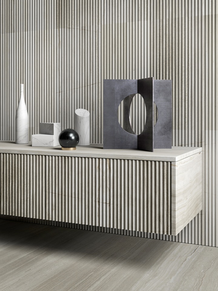
An open plan entryway
An increasingly popular trend in modern homes is to have the entrance open directly into the living room, and in some cases, even into the kitchen, and this entails a slightly different approach to planning its décor.
An advantage of this type of layout is that the entrance area will inevitably enjoy more natural light, meaning you might not need any lamps or ceiling light fixtures.
However, while there may be plenty more space available to play with, you need to be careful that you don’t end up creating a mish-mash of styles between the entryway area and the rest of the house it flows into. The key here is to find a way to delineate the two zones, whilst retaining some sort of stylistic harmony so that attention is directed to the main part of the home.
The area immediately by the door is the obvious location to create a small corner with the barest minimum furnishing, using every available centimetre, but the ideal solution would be to divide the entryway from the living zone using a large freestanding bookcase, cabinet or sideboard.
Even more practical would be a double-sided cupboard that would not only serve as a partition, but also provide valuable storage space.
By way of a quick summary, we’ve taken a look at the key aspects to take into account when designing or decorating an entryway.
We hope the ideas we have shared have inspired you to think about how you can make your entryway not just practical and comfortable, but also elegant and stylish.
Our website is brimming with images of beautiful interiors and products designed to bring them to life, so why not take a look and contact us if you would like any advice or further information.
