Designing with dark colours
03.2022
There is something infinitely alluring about a space whose mysteries remain unknown, whose corners lay in wait to be discovered
Occasionally, design needs to embrace its darker side. Dark rooms evoke drama: a kind of opulent luxury that sunnier confines have trouble achieving. There is something infinitely alluring about a space whose mysteries remain unknown, whose corners lay in wait to be discovered. Rooms equipped with large windows and ample natural light do indeed benefit from softer, lighter hues, but if the light that naturally enters a room is minimal: leave it that way, the results can be wonderfully surprising.
Decorating with a palette of blacks and dark greys may not be the most straightforward design task, but there are a few simple strategies to make even your most twilight spaces sing.
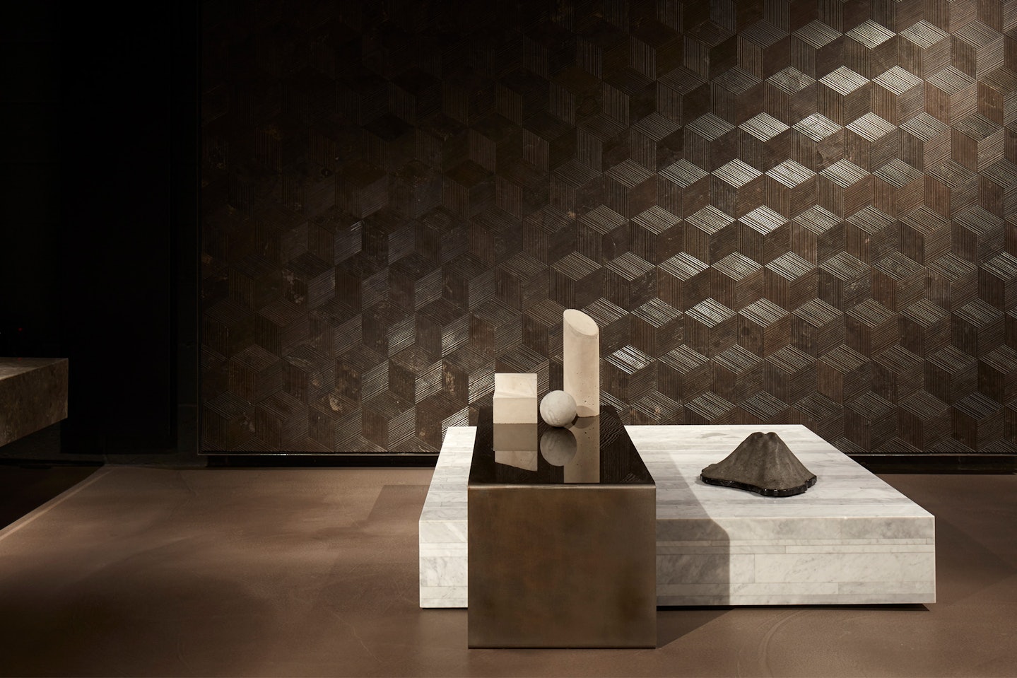
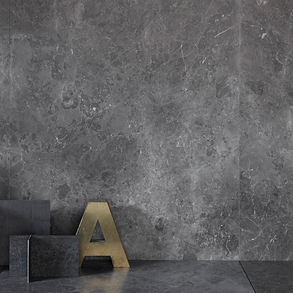
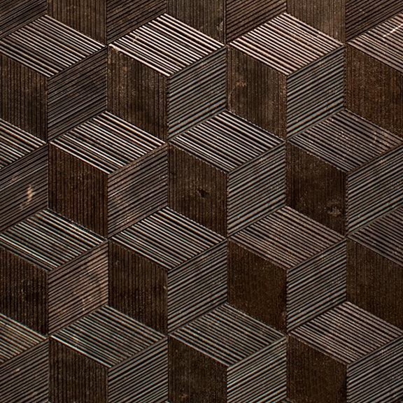
One of the most effective tools of working with darker colours is texture. Forgoing a flat surface can play an essential role in creating a sense of pictorial unity within a space. Salvatori’s textured stone finishes — like the clean, simple lines of Bamboo, the tactile rugged nature of Chiselled or the wood-like finish of Raw — for floors and walls in darker stone shades of Grigio Versilia, Pietra d’Avola and Lava create depth and drama against which to design a composition of furniture and home accessories.
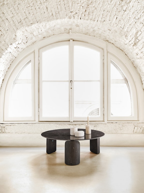
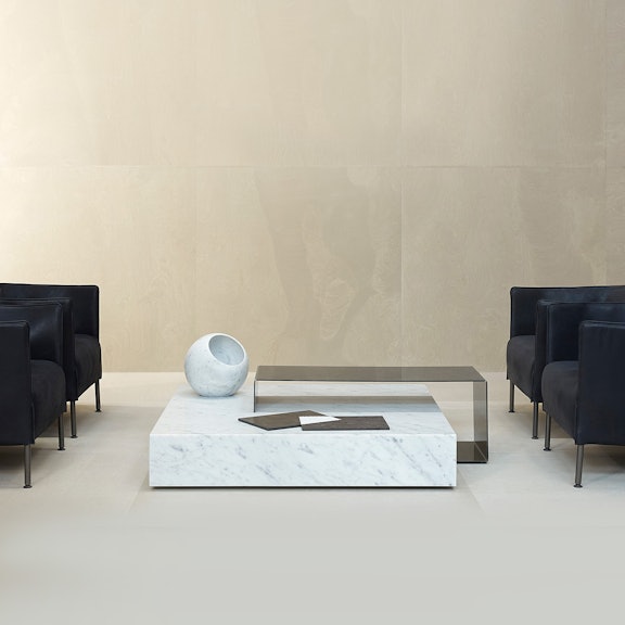
The pieces you choose to populate a dark space must also be carefully considered. Furniture needs to carry a certain amount of weight to anchor itself within a dark layout. Pieces like the matte-finished ‘Love me, Love me not’ coffee table by Michael Anastassiades in Noir St Laurent stone — with its curved, petal-like legs and elegant square top — is substantial enough to hold its own amongst even the inkiest hues. Elisa Ossino’s Proiezioni dining table is another excellent choice. Its slick of half-moon Bianco Carrara marble set within the deep and glossy Nero Marquinia stone creates the perfect monochromatic contrast.
If a bedroom or sitting room awash in shadows feels like too bold a commitment, the ideal place to experiment in darker shades is the bathroom. Smaller rooms soften the dramatic effect of deeper shades. Take for example the smooth, natural finishes of Salvatori’s Onsen collection: a sleek, modern design in Pietra d’Avola stone by Rodolfo Dordoni. The rich colours and clean lines of the polished stone evoke the luxury and tranquillity of Japanese Onsen spas. For a total-look design, match with accessories like PLAT-EAU Bath collection — which includes table mirrors and toothbrush holders also in Pietro d’Avola stone — rounding out a sophisticated total look of Salvatori’s sumptuous natural stone.
