All you need to know about interaction design
03.2022
Discover the world of interactive design that is changing the user experience and creating more intuitive, user-friendly digital interactions
The world of interaction design, and how it is leading to smarter, more enjoyable user experiences
The theme of interaction design has been gaining traction in recent years, but what is it? In short, it refers to a branch of design that is predominantly applied to digital interfaces to create more intuitive and pleasurable user browsing experiences.
In light of our new website about to go live, we thought it was the perfect moment to devote an article to the principles that guided us towards implementing an enhanced interface that brings our claim of “Simply Beautiful Design” to life.
What is interaction design?
The interaction in the title refers to that between human beings and machines, whether of an information technology or mechanical nature. In other words, you could define interaction design as an activity that not only facilitates human-machine interactivity but simplifies it, making the most of complex services and systems in a more efficient and effective manner.
So, now that we have clarified what interaction design means, let’s go further and examine the principles that guide it.
How interaction design works
Interaction design, often also referred to as interactive design, is based on two types of fundamental principles:
- Usability
- User experience
The five usability principles are efficiency, effectiveness, security, usefulness, and ease of learning and retention, with the clear goal being that any design is easy to use. Putting it another way, it’s all about ensuring that that the product is useful or intuitive.
The user experience principles are slightly different, but nonetheless just as fundamental, because they refer to the subjective way a user experiences their interaction with a certain product. This boils down to the fact that the design of a product should revolve around the end user, taking into account not only who will use it but also the context in which it will be used.
The above principles entail a series of necessary activities that must be followed in order to create the right level of human-machine interaction. More specifically, these activities are the identification of needs and requirements, the development of alternatives, the construction of testable interactive versions of any design proposal, testing and evaluation.
Each of the above is fundamental in ensuring a successful result, so let’s take a look at them in more detail.
Identifying needs and requirements
As we said above, good interaction planning should never neglect a study of the final user, not only in terms of user experience but also in terms of needs. The responses to questions such as “What are our users’ needs and how can an interactive product address them?” generate the requirements or prerequisites that the product in question must fulfil.
In order to not only understand what the product you are developing must do, but also to be sure that it will, in fact, address the users’ needs, it is essential to gather data and here, beyond field research, there are four other key methodologies: questionnaires, interviews, focus groups and workshops.
Developing alternatives
Once the end users’ needs have been identified and you have defined the product requirements to ensure it will be easily used, the next step is to develop ideas and alternatives that will satisfy both sides of the equation. This phase represents the crux of the entire design process and can be subdivided into two subcategories:
- Conceptual design
- Physical design
In the first of these two, conceptualising the needs and requirements is undertaken by defining what the object should do, how it should “behave” and how it should look. The second phase is all about defining product details, such as colour, the shape of any symbols and so on. It also includes wireframe design which is essentially a graphic mock-up, or sketch showing how the final product will look.
Creating testable interactive versions of the design
Now that it has become clear what the product should or should not do, it’s time to develop prototypes of the ideas that remain on the table, so that they can be tested. This means that the designs that have been “short-listed” in the previous phase are not developed to the point that they simulate the interactivity that the end user will experience and any potential issues are identified. Prototypes are also useful as a tool when it comes to discussing ideas with all the various interested parties in a project, as they are a practical focus for group communication.
Testing and evaluation
While interactive prototypes and valid alternatives are all very well, they are only useful if the product passes muster and is considered usable. The process of judging their feasibility and success is often called iterative valuation because it involves a variety of diverse criteria which are dependent upon the stage of product development. These include whether the product grabs attention and satisfies all requirements, and this process is essential to ensure that users not only understand how to use it, but also enjoy the experience.
How we applied interaction design to our new website
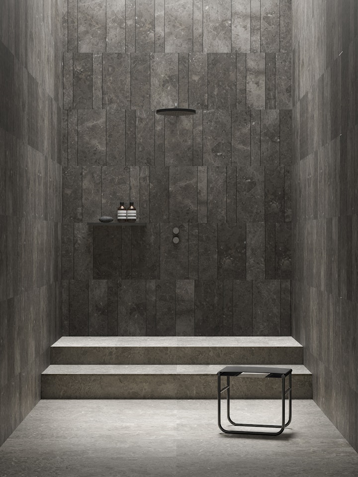
Interaction design has a wide range of applications, from apps through to creating websites where the use of interactive prototypes creates an environment that is easy and pleasurable to navigate. It designs a user experience in the digital world along the same lines as we design the interactive experience between users and our own physical products in natural stone.
During the process of designing our new website, the needs of our users were at the forefront, which is why we decided to divide our products into more immediate and complete categories, making it easier to find the perfect solution in fewer clicks. We also enhanced the online purchase process, adding a “sample” section so that it is now possible to order samples of our textures, meaning that you can touch and see the effect in the comfort of your own home or studio if you are unable to visit one of our showrooms.
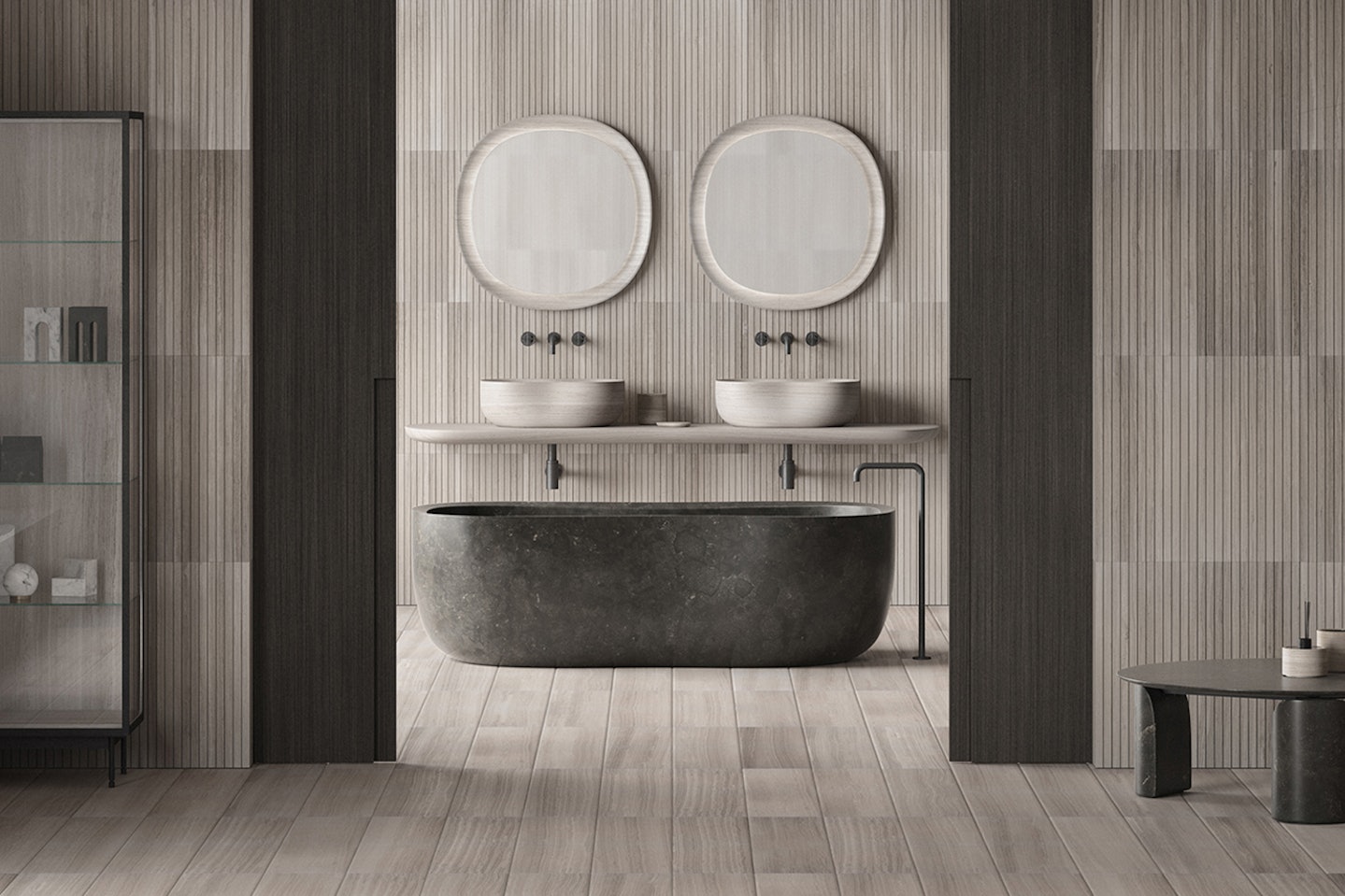
On top of all this, we have expanded our inspirational images, allowing you to browse though Salvatori Total Look solutions. It is now easier to imagine how our products look in a bathroom, kitchen, living room or, in fact any room of the home, and combine them and experiment with colours, textures and shapes.
So, we have now taken a look at interaction design, including its meaning, key principles and how they are applied. We can also say with confidence that we have thoroughly road-tested this approach, using it to design our new website which will be live in a few days. It certainly made our lives easier and we hope that you will enjoy the fruits of it once you start interacting with our site, which we are confident delivers an inspiring and intuitive user experience.
As always, please get in touch if you would like to talk about this topic, our products and services or design in general. We will be delighted to hear from you.
