6 ideas for stylish living room corners
03.2022
Discover 6 inspiring and stylish ideas to help you change an odd-shaped or empty corner in your living room
6 ideas for creating stylish living room corners
With many modern homes pressed for space, the living room often becomes a multi-use zone that has to serve many functions, which is why creating corners or areas for certain purposes can be a useful design approach.
The reverse can also hold true, however, where you end up with an empty corner or odd-shaped space that doesn’t seem to be a part of the rest of the room. With a little creative thinking, however, you can transform such corners into a useful addition that completes the overall living room design.
So, what kind of corners can we create, and what do we need to think about when furnishing them or deciding upon their use?
Let’s take a look at this topic in detail and finish with 6 examples of practical and stylish living room corners.
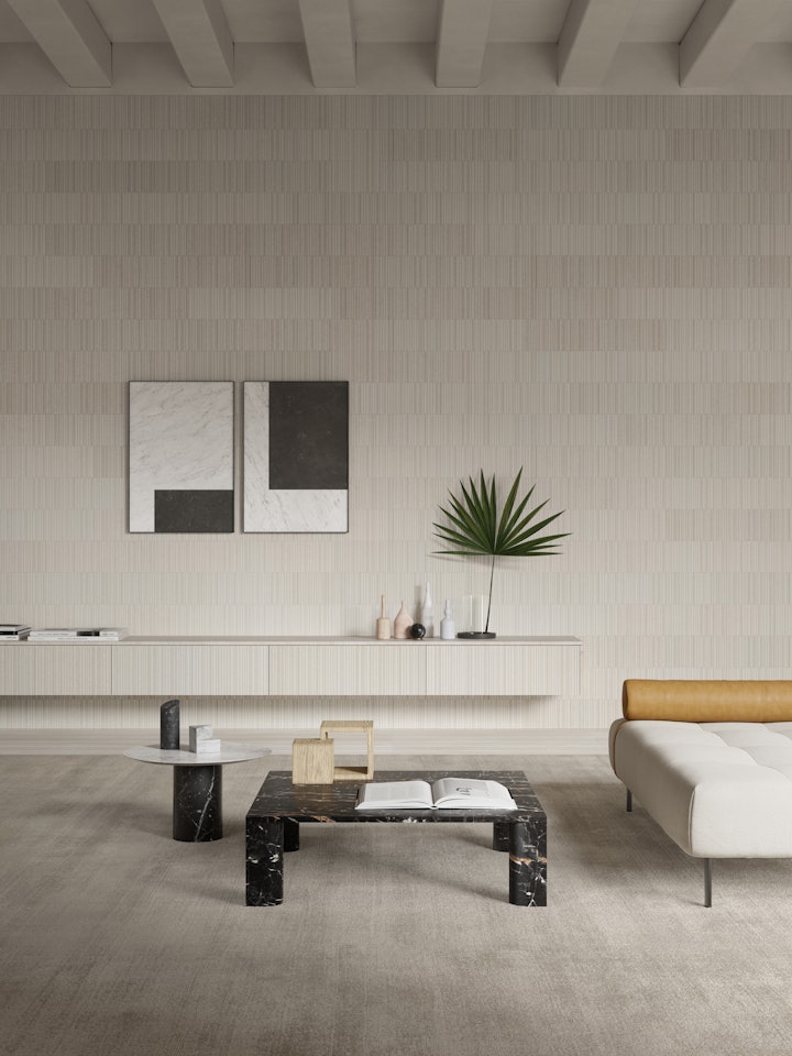
A multi-functional living room
As we said in our introduction, the modern living room tends to be used in many different ways, often simultaneously by various household members. It is invariably the place where we entertain guests, relax with the family in front of the television, where we read, study or maybe even work.
In terms of a layout, with the increasing tendency to optimise space by embracing open plan living, it will often have no clearly delineated areas, so you really need to think about the particular functions it should fulfil, and how you can set aside specific areas for some of those.
Factors to take into account include the right choice of furnishing and lighting solutions that help delineate the various zones in the absence of physical partitions. You may also need to consider a kitchen area or entryway that is integrated into the living room.
On top of that, there are many other ways to make the most of the shape and layout of the living room, creating nooks or corners that are useful and fit in with the overall environment. In fact, we’ve got 6 Salvatori-style examples in mind, so let’s take a look at them.
A stylish home office nook
In an era in which working from home has become widespread, converting a living room corner into a home study is an excellent solution if you do not have the luxury of a separate room to give over to your work activities.
It’s also relatively simple to create, as you only need a handful of essential elements. The first is a desk of some sort, but if your mind is immediately conjuring up pictures of the functional, utilitarian examples commonly used in offices, put those to one side and think about a lovely traditional writing desk or alternatives that work with your living room décor.
The second element is a chair that, again, works with the overall look of the space, but also delivers on the ergonomics front, and the third thing you’ll need is a lighting solution so that your eyes don’t tire. With these three ingredients, you are ready to set up your home office, but let’s look at how you can do that with style.
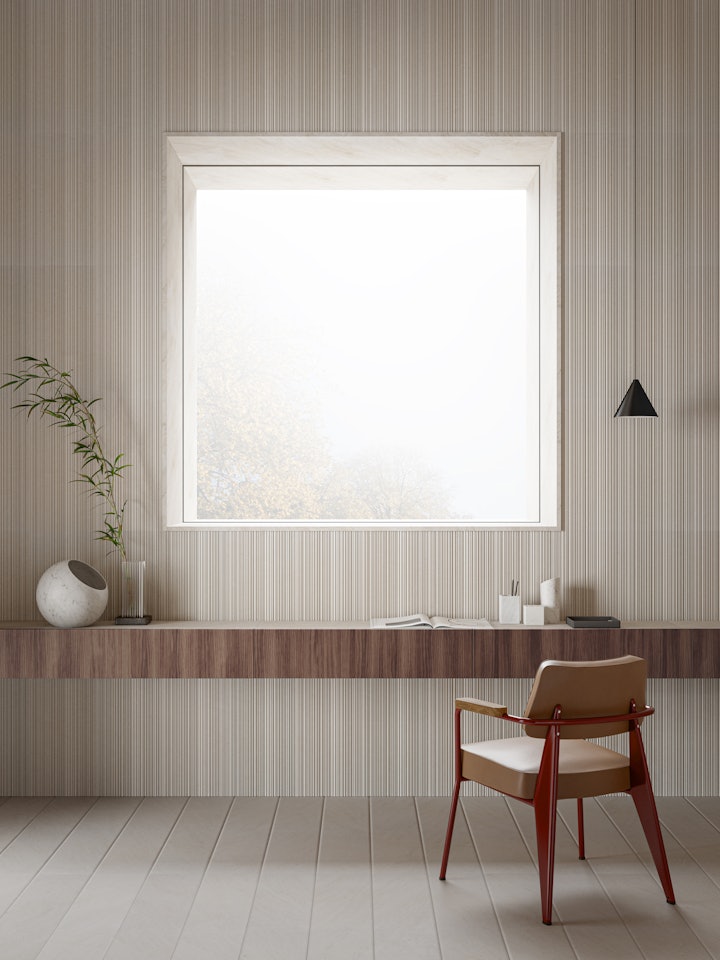
This minimalist living room work corner is the perfect example of how to create a corner that is conducive to working, but also looks as though it belongs in a home, rather than an office building. The starting point is the desk which has been imaginatively configured by flanking a series of Adda modular drawers. Besides ticking the aesthetics box, this solution provides plenty of practical storage and also enables you to position it at the perfect height for you. Its placement directly under the window optimises the natural light, and the wooden facings pair beautifully with the warmth of Crema d’Orcia limestone, in Stone Parquet on the floor and CNC on the wall.
Accessories such as the Fontane Bianche pen holder and modular trays, together with the Kilos bookend-cum-paperweight, are not only practical, but also add a touch of design to this corner. Completing the look are an Urano table lamp and Pietra L10 vase, because after all, just because you’re working, doesn’t mean you don’t have time to appreciate beautiful objects.
A reading corner in the living room
Settling down in a comfortable armchair with an engrossing book is a wonderful way to pass the time and escape normal life for a while. A reading nook is the perfect solution, not only creating an inviting environment, but also adding interest to the living room and often serving to fill in a so-called dead corner.
It’s also beautifully simple to furnish, requiring just a comfy seat, a reading lamp or light and, ideally, a side table to hold a cup of tea or coffee or perhaps a slice of cake if you’re feeling indulgent. However, if you have just a little extra space, a bookshelf is the ultimate item of furniture to truly foster the idea of a corner dedicated to reading.
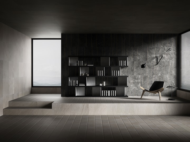
This lovely light-filled living room cleverly makes use of the split-level layout which creates a natural delineation. The seat is positioned perfectly near the window, with a wall lamp angled to provide additional light as needed, and our Pietra L05 table is placed at a handy distance.
The wall in Gris du Marais® Tratti with its accents in gold-colour metal frames the entire corner, while the Colonnata bookshelf adds style and functionality.
The perfect relaxation zone
By nature, the living room is a space that is comfortable and fosters conviviality and warmth, but if you live in a large household, you may welcome a corner you can retreat to every now and then, just to relax on your own.
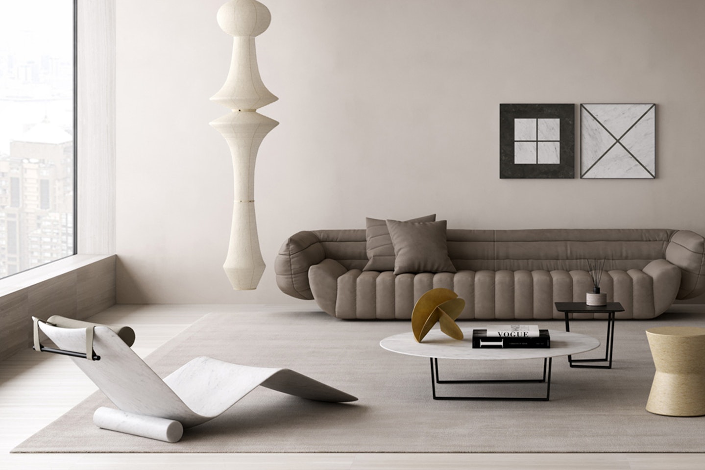
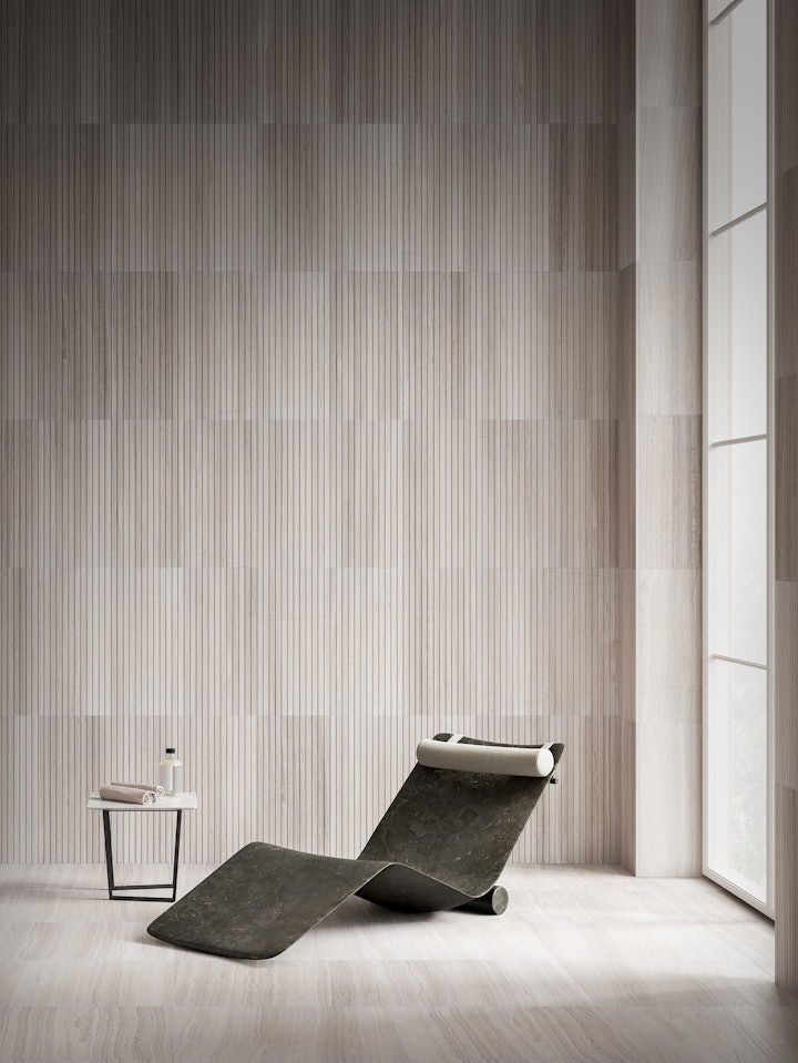
When it comes to furnishing it, you can plump for an option such as oversize cushions or, if you want to maintain a stylish look, because it’s in full view of your living room, you may opt for a more structured solution and enjoy the opportunity to make a statement with a piece of designer furniture, such as our award-winning Curl chaise longue.
Carved from a single block of Pietra d’Avola limestone, it is a bold interpretation of a classic item of furniture and its sinuous curves are both comfortable and eye-pleasing.
Combined with the warm tones of Silk Georgette® in honed and Infinito textures, and completed with a Dritto side table, the result is a simple, elegant corner that offers a wonderful haven when you want some “me time”.
A drinks corner
Relaxing with friends in the comfort of your own home is one of life’s simple pleasures, and all it requires in the way of furnishings is a comfortable sofa and maybe a large-screen TV. If you can add a bar to this mix, you will definitely be considered the host with the most, but if you don’t have the room or the inclination for the full works, you can opt to create a convivial corner in your living room.
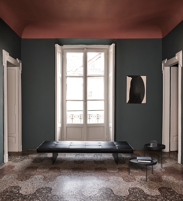
In that case, the key ingredient (apart from those that go into a glass) is going to be a side or coffee table, so that there is somewhere to place your drink. Going a step further, if you can have more than one, even better, as in this living room which features two Pietra L02 side tables. These stylish pieces are not only lightweight and easy to move around, but also hide a bonus function, as they double up as a removable Pietra L01 tray, perfect for serving drinks.
The result is a practical and elegant corner that blends seamlessly with the living room décor.
A mini art gallery
Often the living room is the first area a guest sees when they enter your home, particularly in modern builds, and so it sets the scene, reflecting the style of the rest of the house as well as your taste.
With everything on show, why not take the opportunity to showcase truly special or beautiful objects in their own corner that you might describe as a mini art gallery?
By grouping together pictures, sculptures and other works of art, you display your treasured possessions and add an interesting aesthetic dimension to your living room at the same time.
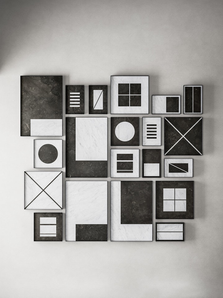
This example shows that even if you don’t have spare floor space, you can still create the idea of a collection on your wall, with this striking composition of our Intarsi stone panels. Inspired by the age-old inlay technique, these pieces of wall art play with bold geometric shapes, contrasting Bianco Carrara marble with the rich dark tones of Pietra d’Avola for a stunning, stylish feature wall.
A touch of green
Today, more than ever, there is a move towards reconnecting with nature and embracing the resources of the world that surrounds us, and even the smallest element of green can help foster a sense of wellbeing as we go about our daily life.
It has been scientifically proven that the mere presence of plants is enormously beneficial to both our psyche and productivity. That doesn’t have to mean surrounding ourselves with a jungle of green, as even a vase with a handful of flowers can have a positive effect on our mood.
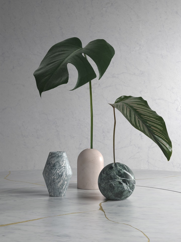
In this case, we have opted to introduce a touch of greenery by means of a simple arrangement of Mono vases. Made entirely from natural stone, they reinforce the sense of nature and provide that crucial interaction with Mother Earth in a wonderfully simple and low-maintenance manner.
On the theme of green, it is fitting that the vases are sitting on a table made from our Lost Stones texture, an example of how design and sustainability can work in harmony. Made from fragments of abandoned or discarded stone, pieced together with a golden-coloured resin, it adds elegance and understated luxury to this delicate interior oasis.
